Creating eye-catching print materials can be a game-changer for your brand. With a few expert design tips, you can make booklets, flyers, and brochures stand out from the crowd and connect deeply with your audience. Whether you’re new to design or looking to refine your approach, here are some tips to ensure your materials look polished, professional, and engaging. As your Sydney print service, we are here to offer advice any time.
1. How Do Colours Impact Print Materials?
Colour is one of the most effective ways to evoke emotion and strengthen brand identity. When it comes to printed materials, colours should be chosen thoughtfully to match the mood you want to convey. Using bold accent colours can make specific elements pop, while sticking with your brand’s palette ensures consistency.

TIP: Remember, colours don’t just appeal to the eye—they help shape how your audience feels about your brand.
2. What Fonts Are Best for Readability?
Font selection and hierarchy play a big role in how people experience your printed piece. For booklets and other detailed materials, readability is key. Combining a clean sans-serif font for titles with a classic serif font for body text creates a modern, professional look that’s easy to read.
TIP: Be sure to keep font sizes and styles consistent to avoid a cluttered appearance.
3. Why Is White Space Important in Booklet Design?
White space, or negative space, is essential for making printed materials easy to read and visually balanced. Adding space between paragraphs, images, and headers guides the reader’s eye and helps them focus on key information.

TIP: For printed booklets, using white space strategically can transform complex information into a visually appealing layout that feels accessible and inviting.
4. How Can Images and Graphics Enhance Print Materials?
High-quality images and graphics make a big impact, especially in booklets where visuals support the text. Avoid low-resolution images that can make your design look unprofessional, and instead, choose high-res graphics that reflect your brand’s identity. Reminder: we can check your files for print-readiness and suitability. It’s part of our service.
TIP: If you’re using multiple images, arrange them thoughtfully so they add value without overwhelming the page.
5. What Are the Finishing Touches That Make an Impact?
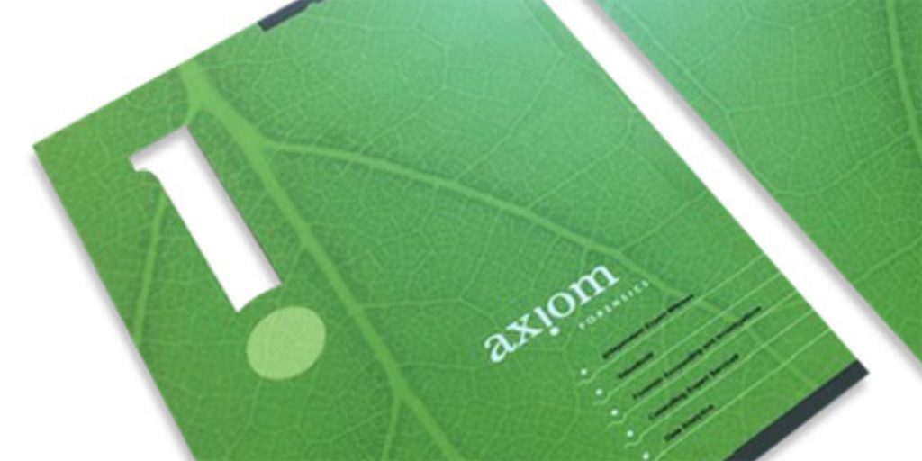
The finishing touches on your printed materials can set them apart. Choosing between matte and glossy coatings, adding custom binding, or even considering die-cut shapes can add a touch of professionalism and make your piece memorable. These details not only enhance the look but also communicate that your brand cares about quality.

TIP: Speak to an experienced printing company for advice on how to add that special ‘something’ to your print material. At Absolute Colour Printing, we have over 30 years’ experience and love making sure our clients get the best possible results without unnecessary upselling.
Ready to Take Your Print Materials to the Next Level?
For businesses looking to make a strong impression, Absolute Colour Printing offers a reliable Sydney print service dedicated to quality and creativity. If you’re ready to bring these design tips to life, take advantage of our booklet special and create printed materials that will truly stand out.

